ARconnecT
Project Overview: Design an app that allows users to easily reserve tickets for local art galleries/ museums and provide audio guides that are easily accessible through their mobile phones. The intended target was both people who are familiar with the art scene and those who may be less familiar. The goal of the app was to provide knowledge about art on display and to help art galleries advertise events.
This project started as a part of Google UX design certification.
Roles:
UX Research // UX Design // Visual Design
Tool:
Figma
Market Research
The market research helped me identify a potential opening for a more personalized and engaging app.
Insight
Based on the competitor market research, I was able to see that the competitors had good content overall, but they lacked accessibility, user flow, and easy navigation. Some apps even lacked a feature element that separates them from other competitors as the app is generally specific to one gallery.
Most apps that offered audio guides at art museums/ galleries had an institutional look that felt more monotonous and flat.
Some apps offered “featured audio guide tours” that are curated based on the user’s moods, which is interesting in theory, but seemed like there weren’t many interests in those curated features for people to enhance their experience at the gallery.
So, I saw the potential in an app where the users can personalize the experience themselves and have access to more than just one gallery.
I conducted a user interview with people who have frequented art galleries and have used an audio tour app to better understand the user’s pain points and motivations for using an art gallery app. Users who participated in the interview were working adults who had been to an art gallery before.
Pain points
Platforms for audio tours are not equipped with assistive technologies or provide diverse language options for those not fluent in English.
Platforms do not have the option to personalize the app to their interests.
Platforms do not have the option to save purchased tickets through the app for easier access or be able to save through other apps for organization, such as Apple Wallet.
Research revealed that the language barrier was not the only factor limiting users from using the art gallery apps that are currently on the market. Other user problems included a lack of personalization options and ease of access that made it challenging for the users to continue to use the apps as the apps did not enhance their experience at the art gallery.
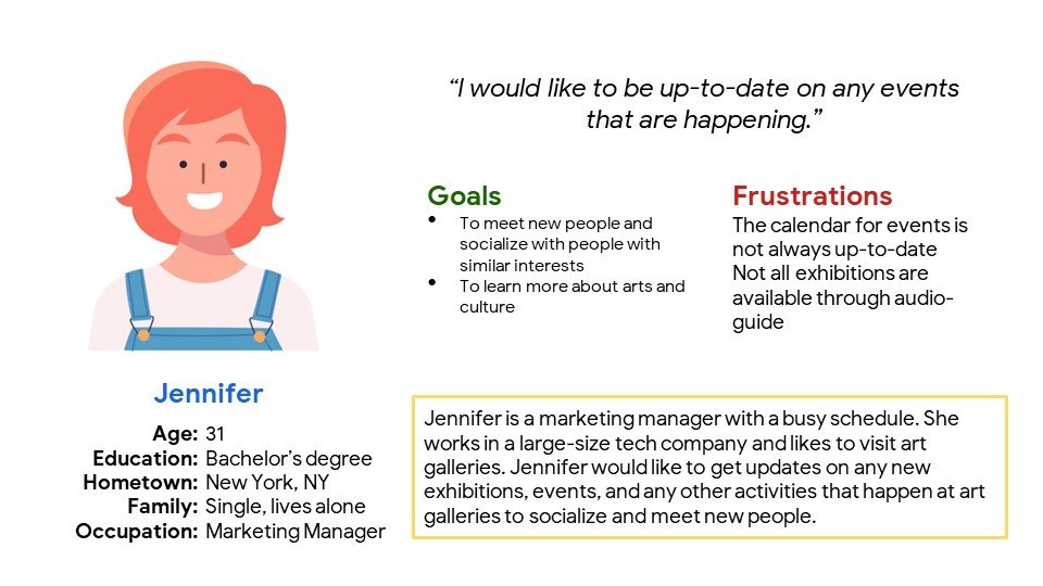
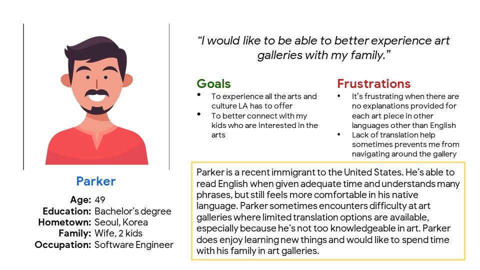
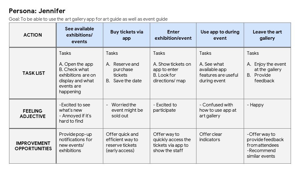
User Persona
By creating a user persona, user story, and user journey map along with the research, I was able to see that there is a need for an app with an easy and accessible user flow. This brought me to the ideation process of creating UX design storyboards and I started to think about ways I can solve the problems.
How might we help our users to easily keep track of events in their area?
How might we improve the app to make it accessible for all?
Wireframes
Usability Study
The Saved Gallery page is not easily accessible from the home screen.
Two separate search options are confusing.
Participants were unable to easily select a date and ticket prices were unclear.
Hi-fi prototype
Takeaways
The app was intended for users to feel like they are connected to the art scene in their neighborhood. While doing the research, I learned what I thought would be the pain point did not align with the actual user’s pain points. The research also led me to identify a potential opening in the market and how to position ARconnecT. Through the process of wireframing, and creating lo-fi and hi-fi prototypes, I learned the importance of having straightforward flows for the users. Simple navigation ultimately leads to providing users with a positive experience.


